Client · Hospitality & property investment
FOS Holdings
A single-page site for a luxury apartment at Embassy Towers in Sandton that does two jobs at once: book a stay, and open a conversation about investing.
Contents · Overview
Overview
FOS Holdings offered a luxury apartment at Embassy Towers in Sandhurst, Sandton — “refined luxury and hotel-level comfort”, in the site’s words — alongside property investment opportunities.
The website put both on one page: the suite, its amenities and neighbourhood for guests; an investment section for partners; and one contact section for bookings, investment partnerships and general enquiries.
That site is no longer public. As of November 2026 the domain shows a holding page while the company rebuilds, so this case study is written from the old home page, the site’s own section list, and the first build’s code.
Challenge
“FOS Holdings offers curated luxury accommodation and property investment opportunities in South Africa’s most prestigious locations.”
one apartment, two jobs
A guest needs to see the apartment, trust the building and the area, and book. An investor needs to see the same property as an asset, and someone to talk to. Two sites would split a small brand in half; a corporate portal would bury the one thing on offer.
The answer was a single page that reads as a luxury hotel listing first, with the investment story inside it, out of the guest’s way.
Goals
goals
Sell the stay first. The first screen is the apartment, a promise of hotel-level comfort, and two actions: explore it, or book it.
Answer everything on one scroll. The suite, the amenities, the neighbourhood, the host and the reviews, in the order a guest would ask.
Give investors a door, not a detour. One section and the shared contact form, rather than a separate site.
Feel as considered as the apartment. Quiet colour, a serif with presence, and motion that rewards attention.
Research & discovery
No research notes survive for this project, so this section shows the approach rather than findings: list what each visitor must know before they act, then give every question a section.
The site itself names its audiences. Reviews come from “business and leisure travelers”; the contact form is for “bookings, investment partnerships, or general inquiries”.
What each visitor needs before getting in touch
- Visitor arrives
- Staying or investing?
- Suite + amenities — A full photo gallery; then a resort-style pool, gym, spa, concierge, restaurant, secure parking, fast Wi-Fi, Smart TV and DSTV.
- Area + host — Sandhurst, Sandton City, Nelson Mandela Square and the LXX lifestyle hub; then About the Host and reviews from business and leisure travellers.
- Read the case — “Wealth-building opportunities through strategic property investment.”
- Contact — Bookings, investment partnerships or general enquiries.
Information architecture & flows
one page, eight anchors
Scroll is the navigation.
There are no inner pages. Every section is an anchor on one long page, in the order of the site’s own list, and the menu jumps straight to five of them — Home, The Suite, Amenities, Invest and Contact.
A guest who never touches the menu still meets everything, in the order they would ask: what is it, where is it, what comes with it — and only then the investment pitch, the host, the reviews and the form.
The one page, top to bottom (anchors from llms.txt)
- Home — #hero — in the menu
- The Suite — #listings — in the menu
- Neighbourhood — #neighborhood
- Amenities — #amenities — in the menu
- Invest — #investment — in the menu
- About the Host — #about-host
- Reviews — #reviews
- Contact — #contact — in the menu
Wireframes
The inner sections of the old site weren’t captured before it came down, so these are low-fidelity redraws: the first screen from the cover, the rest from the section list and the first build’s components. They show structure, not the final layouts.
1 · Arrive
The mark, a two-line serif headline, one sentence of promise, and two buttons — Explore the Apartment and Book Your Stay — beside a tall photograph of the interior.
2 · The suite and its amenities
A large photo with a row of thumbnails below it — in the first build, hovering a thumbnail swaps the main image — then the amenities as a grid of icon cards.
3 · Where it is, and who hosts it
The neighbourhood — Sandhurst, Sandton City, Nelson Mandela Square, the LXX lifestyle hub — then the host and the reviews: the trust a guest needs before booking a stranger’s apartment.
4 · Invest, then get in touch
The investment section pairs a short argument with an image, and the page ends on one contact form for every kind of enquiry, above a footer that slides out from behind the page.
Visual design & system
Luxury Living at Embassy Towers
Headings — on the old site, in the first build and on the holding page
a brand that travels
Quiet colour, one confident serif.
Deep forest green and warm copper on white: colours that read as old money rather than hotel chain. Playfair Display carries every heading; the body stays in a plain sans so the serif keeps its weight.
The system held up when the site came down. The holding page uses the same mark — a green tick that turns into a rising arrow under a bronze bar — the same serif, and a copper line drawing of a building going up beside a crane.
Key screens
The first screen is the only one of the old site on record, and it carries most of the design’s intent.
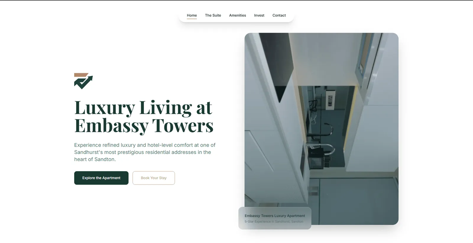
- 1A floating pill of anchors
Home, The Suite, Amenities, Invest, Contact — each one jumps down the same page.
- 2The mark, not the name
The tick-and-arrow sits above the headline; the name is left to the copy.
- 3The place is the headline
“Luxury Living at Embassy Towers”, set large in Playfair Display.
- 4Explore, then book
A solid forest button for looking around, a copper outline for booking.
- 5A frosted caption card
“Embassy Towers Luxury Apartment — 5-Star Experience in Sandhurst, Sandton”.
Build & handoff
The first build is a single React 19 page on Vite: one component per section, a shared ScrollReveal wrapper that fades each block up as it enters the viewport, and the forest and copper colours as CSS variables. Its section ids — #listings, #amenities, #investment, #contact — are the anchors the finished site kept.
Most of the effort went into small interactions that make a static listing feel handled:
interactions in the first build
- A “living canvas” behind the page: three heavily blurred forest and copper blobs that drift and lean towards the cursor.
- A navigation of three floating glass islands — the logo, the section links, and a phone button that opens WhatsApp — that restyle once you scroll.
- A gallery whose main photo swaps as you hover each thumbnail.
- A 2× magnifying lens that follows the cursor over the investment image.
- Beside the contact form, a small 3D house built from CSS walls and a roof that turns with the mouse; below it, a footer revealed from behind the page at the end of the scroll.
- Menu links that glide to their section on a custom eased scroll.
const handleMouseMove = (e) => {
  const rect = imgRef.current.getBoundingClientRect();
  const x = e.clientX - rect.left;
  const y = e.clientY - rect.top;
  const lens = lensRef.current;
  lens.style.left = `${x - 75}px`; // centre the 150px lens
  lens.style.top = `${y - 75}px`;
  // Zoom 2x: double the background, then offset it to the cursor
  lens.style.backgroundSize = `${rect.width * 2}px ${rect.height * 2}px`;
  lens.style.backgroundPosition = `-${x * 2 - 75}px -${y * 2 - 75}px`;
};-
First build
One React page with every section and interaction in place; copy, contact details and reviews still placeholders (file dates in the local repo).
-
Committed to GitHub
The first build pushed as a single initial commit.
-
Holding page
fosholdings.co.za shows “Our website is under construction”.
Outcome & learnings
The Embassy Towers site was live, and is now down. As of 5 November 2026 the domain shows a holding page: “Our website is under construction. We are refining the experience.” The company now describes itself as “A holding company”, based in Sandhurst, Sandton.
Nothing in the sources says what the new site will contain or when it launches, so the portfolio hides the live link until it’s back. No booking or enquiry numbers were documented for the old site, and none are claimed.
learnings
Real content before effects. The first build had every interaction working while the phone number, reviews and figures were still samples. The effects were the easy part; the words were what the page needed.
Make the brand portable. The mark, the palette and the serif moved to the holding page untouched — the company still looks like itself while the site is away.
Write the site down. The site’s llms.txt, a plain list of its sections, is how this case study knows what the page contained after it came down.