Client · Fashion & streetwear
Talk to Stino
A custom, animation-led storefront for a black-and-white Lagos streetwear brand: the garments hang on a rack you can drag, and if your colour isn’t there you can talk to Stino on WhatsApp.
Contents · Overview
Overview
Talk to Stino is a premium streetwear brand with a bold black-and-white look and a mascot — a cartoon face with braids and piercings, “TALK TO STINO” written across the lips. It sells in Nigeria, priced in naira.
The store is a custom Next.js front end on headless Shopify: Shopify runs the products, stock, cart, checkout, payments and customer list; the code is everything the shopper sees and touches.
The brief & feasibility
“Clean black-and-white visual language … Fixed bottom email registration bar … Mobile-first responsive layout”
The brief set the bar at “Litgang / YL Collectives quality”. The product requirements turned it into a sharper aim: an animation-led store that borrows the hanging-rail idea of the Snug Wrld concept store, kept monochrome and made highly interactive.
Feasibility was answered on day one: the build itself was doable that week. The two real blockers sat outside the code — approval from a payment provider, and photography of the garments for the rack.
The primary shopper is “the drop chaser”: 18–30, in Lagos, Abuja or Port Harcourt, arriving from an Instagram story on a phone. So the critical journey is short and mobile-first:
J1 · Instagram link to paid order
- Instagram link — The main audience arrives from an Instagram story, on a phone, often on mobile data (PRD §4.1).
- Product focus view
- Colour tag + size
- Add to bag — The bag drawer opens straight away.
- Shopify checkout — Contact, delivery and payment happen on Shopify’s own checkout.
- Confirmation
Goals & anti-goals
goals
G1 Sell in naira — an Instagram link to a paid order in under 90 seconds.
G2 Be memorable — “clearly more engaging than Litgang”.
G3 The brand runs it alone — a change in Shopify shows on the site in about a minute.
G4 Grow the Stino List. G5 Turn WhatsApp colour requests into demand data. G6 Stay fast on a mid-range Android over 4G.
anti-goals, word for word from the PRD
- Animation that gets in the way of buying.
- A desktop showpiece that is clumsy on phones.
- Needing a developer to change a price or mark something sold out.
- Color creeping into the interface.
- Copying the reference.
- Touching card data.
References
snug wrld — primary
Take the rail. Fix the two weak spots.
From the Snug Wrld concept store: the hanging rail, garments that grow on hover, a blurred focus view, and colour swing tags that wipe from bottom to top.
Its two weak points became requirements: buying happened on a separate, standard Shopify theme, and on phones the rack shrank to thumbnails. Here, the rack *is* the shop on every screen size.
yl collectives
Start from the logo.
YL Collectives contributed one idea: a loader that starts from the logo and animates it while the page loads, then reveals the store. Their live site showed no loader, so this one was designed from that description — in Figma first, frame by frame.
litgang — secondary
Keep what works locally.
From Litgang (a Dawn-theme store): naira-first pricing, delivery times on product pages, WhatsApp as a human channel, bundle offers and a mascot loader. What to beat: a washed-out, low-contrast hero and a generic theme layout.
Information architecture
The sitemap stays small on purpose. A product opened from the rack is an overlay over the blurred rack, with its own URL; the same URL opened directly is a full page. The header, ticker, bag drawer, email bar and footer are on every page.
Sitemap (PRD §7.1)
- Home · the rack
- Shop grid
- Feed — Posts are Shopify blog articles the owner writes in the admin.
- Biography — /about redirects here.
- Contact
- Product — An overlay from the rack (client-side URL), a full page on direct visits.
- Feed post
- Bag drawer
- Shopify checkout — Hosted by Shopify on checkout.<domain>.
home, top to bottom
Rack → Ticker → Statement → The Drop → Lookbook → Meet Stino → From the Feed → Newsletter teaser → Footer. The rack comes first because the rack is the product.
Visual system
“The interface is black, white and grey. Color appears only in product photography.”
TALK TO STINO
Display and product names
Every piece starts with a question, and Stino always answers.
Interface and body, variable 100–900
ONLY 3 LEFT IN M
Swing tags, tag prices, the loader counter
Don’t see your color? Talk to Stino.
Hand-written accents only
the mascot, in layers
One logo, five layers.
The mascot was cut from the brand’s artwork into stacked transparent layers — line art, fills, face, lips and eyelids — so the loader can draw it, fill it and wake it up, and so it can wink when you join the Stino List.
There is no red or green anywhere: status is shown with an icon, a word and weight. Contrast is 17.5:1 for ink on paper.
Loading interactive demo…
Design in Figma
The whole store was designed before it was built: nine pages from the cover to the biography, desktop at 1440 and phones at 390, each page with notes on behaviour and on what was still waiting for the brand (prices, rack order, photography).

1 · Draw
The loader starts from nothing but a 000 counter. The mascot’s line art draws in over the first 600 ms.
2 · Fill
Between 500 and 850 ms the fills arrive, and the face reads as the logo.
3 · Wake
Stino blinks and the lips write on. If the store is still loading, the mascot breathes and waits.
4 · Hand over
An ink wipe rises while the mascot flies up to become the header logo, and the rack settles in. The whole thing takes 0.9–2.2 s, any tap skips it, and reduced-motion visitors get a 300 ms fade.
Key interactions
the rack
A rail you can throw.
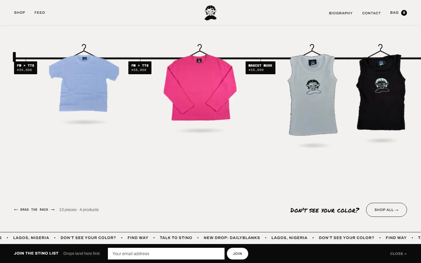
On desktop the rack is one long rail you drag sideways, with inertia. Garments hang on springs, sway a little at rest and grow from the hook on hover; the last hanger is always empty, with a hand-written note. On phones it becomes a swipe rail, not a grid of thumbnails.
Try the miniature: drag it, or focus it and use the arrow keys.
Loading interactive demo…
- 1Swing tags
Each tag carries the product and its naira price in Space Mono — the care-label voice.
- 2Drag the rack
A plain instruction where the rail ends; the rail itself is the scroll.
- 3Don’t see your color?
The hand-written prompt that opens the colour request.
- 4Ticker
Paper and ink versions; it speeds up as you scroll.
- 5The Stino List
The fixed email bar from the brief. Joining creates a Shopify customer, tagged source:stino-list.
Swing tags are the colour picker
On the product, each colour is a swing tag. The dashed “?” tag is for colours that aren’t on the rack.
Ask for a colour
A sheet opens with the product already filled in. Pick the colour (required), a size, and optionally “email me if this color drops” — which tags the customer in Shopify as wanting that product in that colour.
Talk to Stino
“Continue on WhatsApp” opens a chat with the message already written: “Hi Stino 👋 I can’t find my color…”. A sale that starts there closes as a Shopify draft order with an invoice link.
Or straight to the bag
If the colour is there, it goes in the bag — a bottom sheet on phones, a drawer on desktop — kept on Shopify’s Cart API. “Shipping calculated at checkout.”
J3 · Colour request
- Rack or product
- Colour on the rack?
- Add to bag
- Colour request sheet — Product prefilled; colour required; size; quick chips. “Just open WhatsApp” skips the form.
- WhatsApp, message written
- Draft order + invoice — The brand turns the chat into a Shopify draft order with an invoice link.
- Email me if it drops — Opt-in: the customer is tagged wants:<product>:<color> — demand data (goal G5).
Build
“Shopify is the engine, our code is the body.”
How the pieces talk
- Shopper’s browser
- Shopify admin — The brand edits products, stock, posts and the biography here — no developer needed (goal G3).
- 5 webhooks — Sent to /api/revalidate, which refreshes the cached pages.
- Next.js 16 on Vercel — App Router; catalogue and content cached, the cart never cached.
- Storefront API — Products, the rack collection, cart, the Feed blog and the Biography metaobject.
- Admin API — Scoped to customers only: the Stino List.
- Shopify checkout — Paystack first, then bank deposit.
Pages read through one commerce layer that can switch between real Shopify and sample data — which is how the whole storefront was built and reviewed before the store had a single product in it.
Catalogue and content are cached and invalidated by Shopify webhooks; in testing, a stock change showed on the live site within 3 seconds, and again within 8. Payments stay inside Shopify: Paystack’s official Shopify app is connected in live mode, with bank deposit as the fallback. The site never touches card data.
products(first: 100) { nodes {
  handle title description productType
  options { name optionValues { name } }
  priceRange { minVariantPrice { amount } }
  variants(first: 100) { nodes {
    id availableForSale quantityAvailable
    selectedOptions { name value }
    swatch: metafield(namespace: "tts", key: "swatch") { value }
    cutoutFront: metafield(namespace: "tts", key: "cutout_front") {
      reference { ... on MediaImage { image { url } } }
    }
  } }
} }
rack: collection(handle: "the-rack") {
  products(first: 100, sortKey: COLLECTION_DEFAULT) { nodes { handle } }
}motion, built as small reusable pieces
- Swing — garments and tags on spring physics (stiffness 120, damping 8)
- Fly-to-bag — the garment travels to the bag icon
- Page curtain, image reveals, line draws, hand-writing
- Magnetic buttons, tilt, parallax, pop-in chips
- Mascot follow and wink
- Reading progress
Shipping
The work happened in five sessions, logged as it went. The major phases each ended with an independent code review, and its findings were fixed before moving on.
-
Brief to working storefront
Feasibility and direction, the PRD, the Figma designs and loader prototype, then the whole store built on sample data, browser-checked, reviewed (1 critical, 9 important findings fixed) and merged.
-
Motion everywhere
Animations and micro-interactions across every page, an animation review, and the loader set to replay on every reload. A cursor glow was removed at the owner’s request.
-
Connected to the real store
Store review, the Shopify provider, catalogue/feed/biography imported (all 53 variants), a Vercel preview, five webhooks, WhatsApp, and an independent review (0 critical).
-
Contact details
Contact page and social links.
-
Payments live
Paystack connected through Shopify in live mode; checkout offers Paystack first, then bank deposit.
Outcome & next
The store is a working preview: connected to Shopify, taking payments, not launched. Copy on the biography and feed is still draft for the brand to approve, and only garments with a photographed cut-out hang on the rack (13, plus the empty hanger).
open before launch
- Domain and the Vercel Pro upgrade
- Shipping rates and store policies
- Copy approval (biography, feed)
- Photography for the remaining colourways
- Paystack compliance and VAT handling
- Analytics (not built yet)