Client · Real estate & hospitality
Bricks and Keys
A Lagos real-estate company with two very different visitors — property investors and shortlet guests. The home page asks each of them one question and splits the site down the middle.
Contents · Overview
Overview
Bricks and Keys Luxury Homes works in two corners of the Lagos property market at once. It develops real estate — its logo reads “hospitality · management · construction” — and it runs luxury shortlet apartments for guests in Nigeria and the diaspora.
The website had to serve both without blurring them: investors looking for their next acquisition, and guests looking for a few nights somewhere comfortable. It was designed and built on Wix by Blackstar Studios.
Challenge
The two audiences want almost opposite things from the same brand. An investor is weighing a large, slow decision: the development, its location, what is built in, a starting price, and someone to talk to. A guest is making a quick one: which area, how many people, what is included, the house rules, and whether the dates are free.
Put both on one generic property homepage and each visitor has to wade through the other’s content. Split them into two websites and the company loses the one brand that ties its homes and its apartments together.
 Investor · Projects
Guest · Shortlet
Goals
goals
Split the journey at the front door. One question per audience, side by side, before anything else.
Look the part. A premium, uncluttered feel — gold and charcoal on white — that suits both a development brochure and a luxury apartment.
Keep a person one tap away. A WhatsApp button on every page, and separate lines for property and shortlet questions.
Make listings quick to scan. Name, area, four amenities, a price and one button.
Research & discovery
The research notes from the project aren’t part of this write-up. The approach for a two-sided property site is to list, for each audience, the questions they need answered before they act — and then check that every one has a home on the site.
For guests, the site’s own FAQ is the best record of those questions: do I have to sign up to book (no), how do I pay (naira, dollars or a Nigerian bank transfer), how do I check a date, which areas you cover, the cancellation notice, whether I can inspect first, parties, discounts for longer stays, and the caution fee.
What each visitor needs before acting
- Visitor arrives
- Buying or staying?
- Development + location — Abira Court, Lekki: the estate, its neighbourhood and nearby landmarks.
- Amenities + starting price — Twelve amenity icons on the project card, from smart-home-ready to clean water.
- Talk to someone — A real-estate enquiry line, WhatsApp, or the contact form.
- Area + capacity — Bedrooms, beds, bathrooms and maximum guests, at the top of the apartment page.
- Amenities + house rules — Check-in after 2 pm, check-out 11 am, no parties, no smoking (Aurora).
- Dates + book — Adults, children and dates, then Book Now — no account needed.
Information architecture & flows
The navigation stays short — Projects, Shortlet, About, Contacts — and the home page does the sorting. Its left half sends investors to Projects; its right half sends guests to the shortlet listings. The two paths never cross until the footer, where even the contact details are split by intent.
The split-screen home, as a flow
- Home — Two questions side by side.
- “Explore” — Left half: “Looking for the next big thing in real estate?”
- Projects
- Project page — Abira Court: gallery, neighbourhood, description, amenities.
- Make a reservation
- “Browse Shortlet” — Right half: “I’m looking for the ideal getaway spot?”
- Shortlet listings — Twelve apartments, each with an area, four amenities and a nightly price.
- Apartment page — Capacity, amenities, things to know, the price per night.
- Book now
- Need Help? (WhatsApp) — A floating button on every page.
1 · Two questions, one screen
The home page doesn’t introduce the company. It asks the visitor which of two people they are, and gives each half its own button: a solid charcoal “Explore” on the investor side, a gold-outlined “Browse Shortlet” on the guest side.
2 · The investor’s path
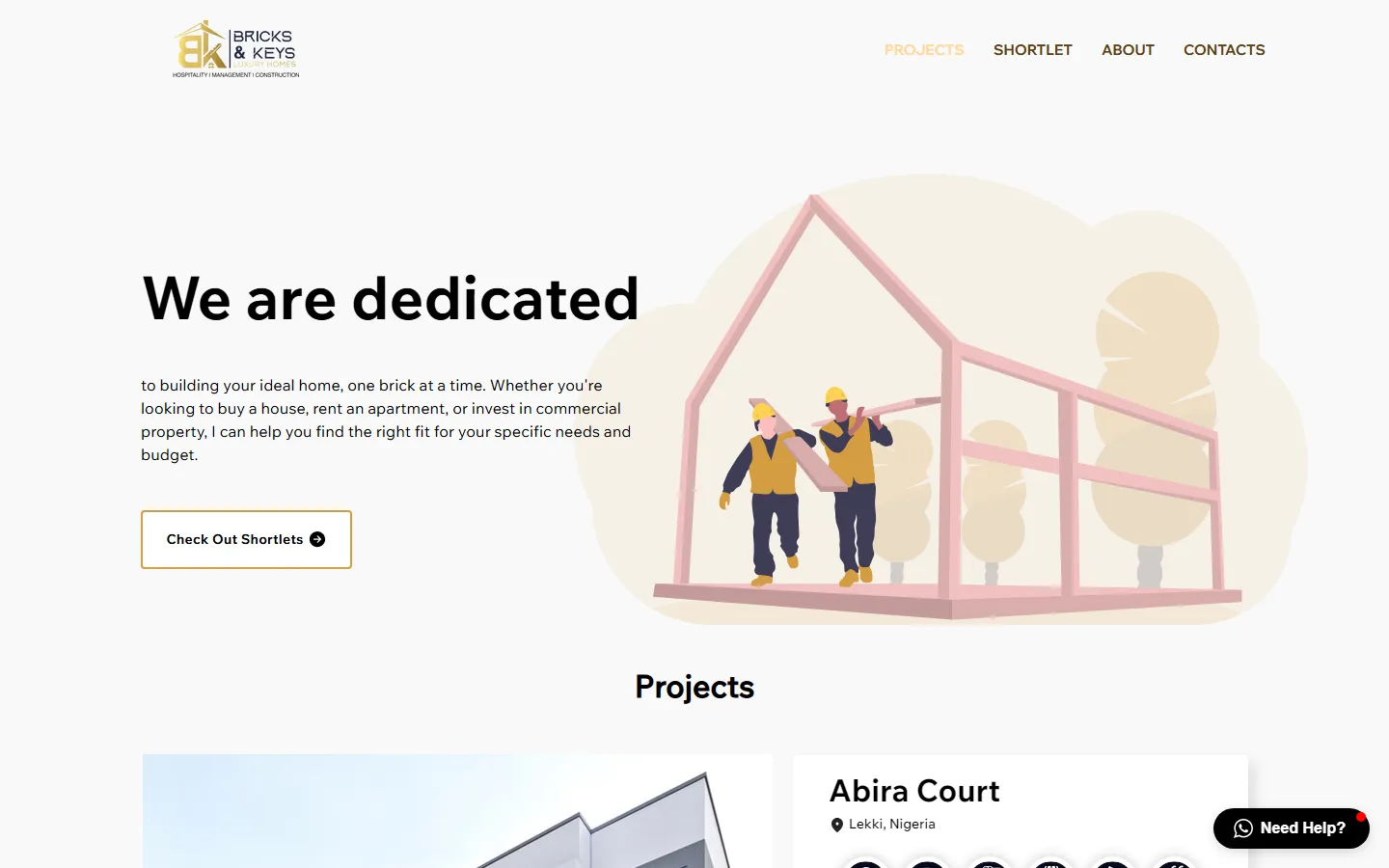
Projects opens on a plain promise — “to building your ideal home, one brick at a time” — then the development itself: Abira Court in Lekki, its gallery, twelve amenities, a starting price and Learn more.
3 · The guest’s path
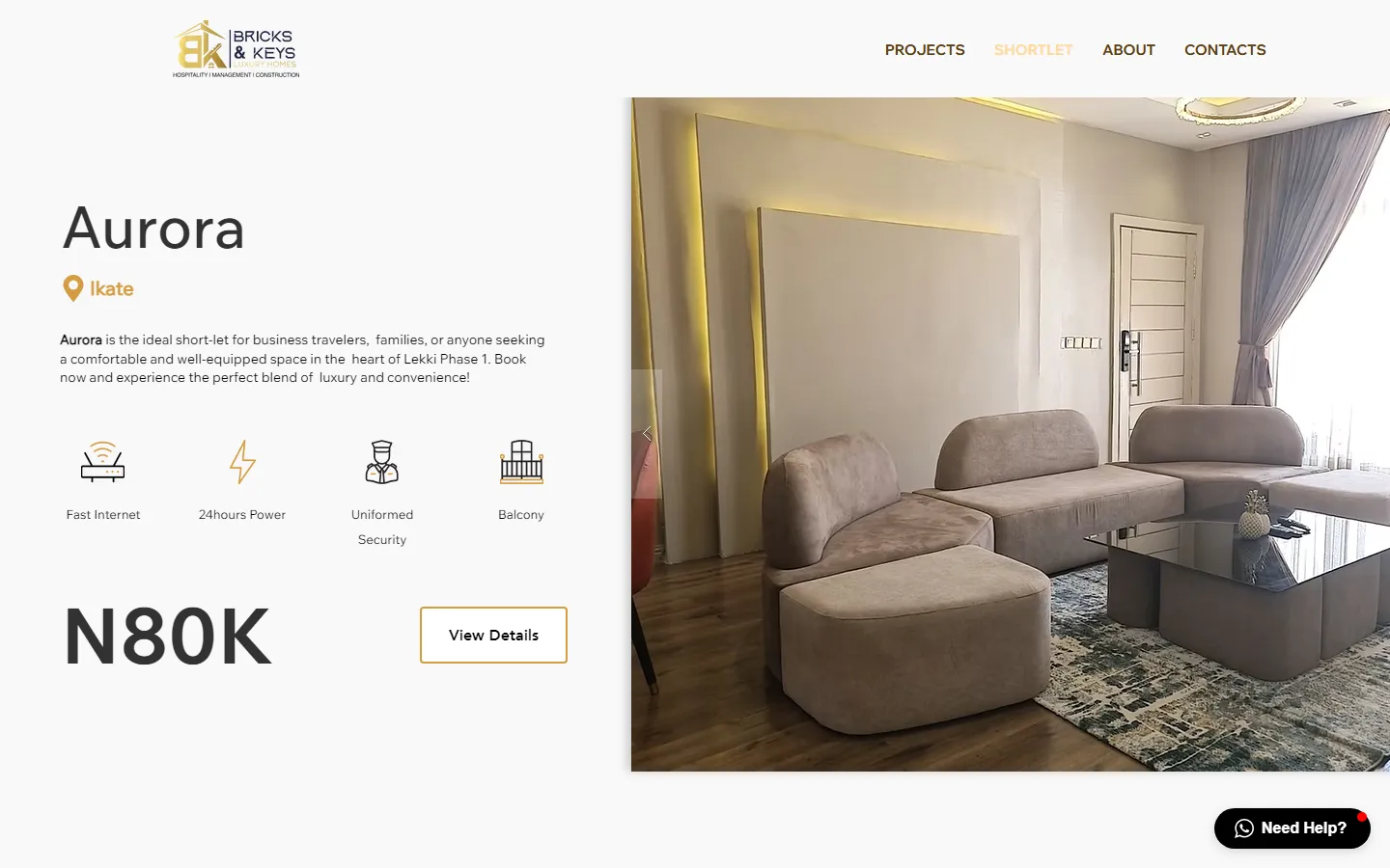
Each apartment gets a full-width row: the name, the area with a gold pin, a line of description, four amenity icons, the price in large type and View Details, beside a photo carousel.
4 · From apartment to booking
The apartment page answers the remaining questions in order — capacity, amenities, things to know — then ends in the booking form: adults, children, dates, Book Now. No account is needed.
Wireframes
Early sketches aren’t among the sources, so these are low-fidelity redraws of the live structure. They show the decision that matters most: the home page is two columns of equal weight, and the listing page is one repeated row, so a guest can compare apartments by scrolling rather than by opening each one.
Visual design & system
Looking for the next big thing in real estate?
Hero questions and page headings
gold, charcoal and air
The palette does the sorting work too. Gold marks the guest side and the brand; charcoal marks the investor’s solid button and every form’s submit. Thin golden arcs sweep across the home page behind both halves, tying them into one picture.
Amenities are drawn as simple line icons in gold and charcoal, so a guest reads “fast internet, 24-hour power, security, balcony” at a glance. Warm apricot gradients are kept for the moments that ask for something — joining the email list, getting in touch.
Key screens
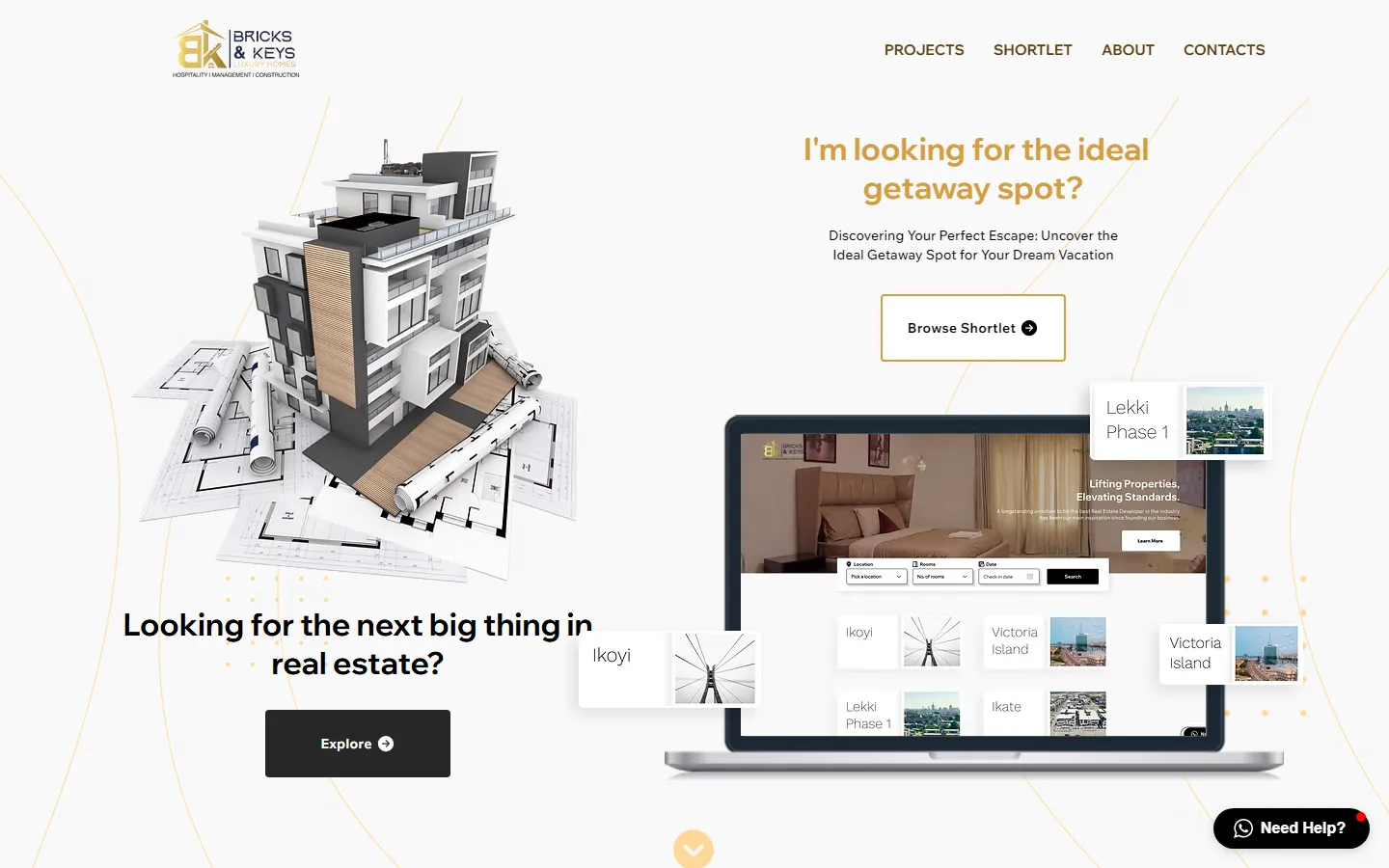
- 1One brand, three trades
The logo carries “hospitality · management · construction” under the wordmark.
- 2The investor’s question
“Looking for the next big thing in real estate?” with a solid Explore button to Projects.
- 3The guest’s question
“I’m looking for the ideal getaway spot?” in gold, with an outlined Browse Shortlet button.
- 4The product, shown
A laptop with the shortlet search, and floating cards for Lekki Phase 1, Ikoyi and Victoria Island.
- 5Need Help?
The WhatsApp button that follows the visitor to every page.
shortlet listings
One row per apartment.
Twelve apartments across Ikate, Lekki Phase 1 and Osapa London, each in the same row: name, area, a short description, four amenities, the price, View Details. Every row has its own photo carousel, so a guest can look inside without leaving the list.
projects
A development, laid out like a brochure.
Abira Court gets a large photo with thumbnails, a card with its location and twelve amenity icons — smart-home ready, internet, drainage, road, CCTV, pool, parking, 24/7 power, gym, fitted kitchen, gated community, clean water — and a starting price beside Learn more.
Build & handoff
The site is built on Wix: listing pages with photo carousels, a booking form, an FAQ, an email list and a WhatsApp chat button. The dual-intent idea carries through to the parts visitors rarely notice:
Contact routing in the footer
- A question
- About property or a stay?
- Real-estate line — “Inquiry Regarding Real Estate”: a phone number with Chat on WhatsApp.
- Shortlet line — “Shortlet Question”: a second number with its own WhatsApp link.
- Two Instagram accounts — Bricks Homes and Bricks Shortlet, listed separately.
what the build includes
- A floating “Need Help?” WhatsApp button on every page.
- Apartment pages with capacity, amenities, house rules and a booking form — no account needed to book.
- A guest FAQ covering payment, availability, cancellation, inspections, parties and caution fees.
- A “Join the Club” email list for subscriber-only deals, and a short contact form.
Outcome & learnings
The site is live at bricksandkeys.com.ng, with both paths working end to end: a development an investor can explore and enquire about, and twelve apartments a guest can browse and book. No traffic or booking numbers are documented, so none are given here.
The split-screen home earns its place: it lets one brand hold two businesses without either audience reading the other’s pitch.
on a phone
The phone layout is where the next round of work sits. In this capture the investor headline runs off the right edge of the screen, and a floating location card sits on top of it.
next round
- Re-stack the home hero for phones: one question per screen, cards below the text.
- Keep contact details in one place — the two phone lines swap places between the home footer and the other pages.
- One shortlet page instead of two copies (the menu and the home button point at different URLs).