Client · Fintech & crypto
Bytefi
A crypto wallet designed to feel like a banking app: trade, keep your assets and spend them through a virtual or physical card — with balances in naira and one clear action per screen.
Contents · Overview
Overview
Bytefi is a crypto wallet: people trade cryptocurrency, keep their assets in one place, and spend them through a virtual or a physical card. This project is the mobile app’s UI/UX design in Figma — the full set of app screens, plus a definitions frame for colour, type and components.
The idea running through it is clarity first: make the wallet feel like the banking apps its users already know, with balances in naira, plain verbs, and one clear action on each screen.
Challenge
the problem
Crypto is hard to start with.
Wallets, coins, networks, swaps and trades come with their own vocabulary, and a crypto app can easily greet a newcomer with charts and long addresses before they have done anything.
Bytefi wanted all of it — trading, storing assets, paying by card — in an app a first-timer can use, without taking away the depth an experienced user expects. And because it holds people’s money, every screen also has to feel safe.
Goals · clarity first
banking patterns, with crypto inside
- Naira first. Every balance leads with its naira value; the coin amount sits underneath, in grey.
- Plain verbs. Send, Receive, Order — and history rows that read “Swap NGN to BTC” or “Sent to 0002345555”.
- One action per screen. A single full-width button closes each form.
- Progress you can see. Peer-to-peer trades get a three-step tracker: order created, pay the seller, release crypto.
home
An account overview, not a trading desk.
The header shows one number — the combined wallet value — in the currency chosen in the switcher (NG Naira here). Under it sit four actions: Send, Receive, Order and More.
Assets read like bank accounts: the naira wallet, then Bitcoin and Ethereum, each with its naira value first and the coin amount below. Activity is a short statement — “Received BTC”, “Sent BTC” — with dates and both amounts.
Research & discovery
The work starts from what Bytefi’s users already do on their phones: they bank in naira, buy airtime, pay bills and verify their identity for banking apps. Those habits became the template, and the crypto features were fitted into them rather than given conventions of their own.
bills
Ask what a bank would ask.
Bill payments show the idea at its plainest. Buying airtime asks exactly what a banking app asks — phone number, amount in NGN, network (MTN, Airtel, Glo, 9mobile) — and nothing about crypto.
Money moves in the same way: the wallet holds naira, US dollars, British pounds and euros, and a funding screen offers P2P trading (tagged “Quickest option”), the Bytefi wallet, or a card or bank account.
Information architecture & flows
The App Screens page is split into seven sections, and together they read as a journey: sign up or log in, get verified, land on Home, then go to cards, transactions or settings.
App Screens page · seven sections as a journey
- Sign up — 14 frames: email or phone, or Google.
- Log in — 14 frames.
- Account verification — 13 frames: country, personal information, government ID, liveness check.
- Home & options — 16 frames, including wallet options in NGN, USD, GBP and EUR.
- Card options — 37 frames — the largest section.
- Transactions — 4 frames.
- Profile & settings — 12 frames.
Cards is the largest section, and the place the banking pattern pays off most. A segmented control switches between the virtual and the physical card. The virtual card looks like a bank card, with Add funds and Withdraw; the physical card screen explains what it’s for and what it costs before offering to create or activate one.
Cards · virtual or physical
- Cards tab
- Virtual or physical? — A segmented control at the top of the card screen.
- Virtual card — Balance, masked number, expiry and a hidden CVV.
- Add funds or withdraw — A withdrawal from the card lands in the Bytefi wallet.
- Transaction details — A sheet over the card: type, amount, date, a sentence on what happened, and Report a problem.
- Physical card — For online shopping, subscriptions and cash withdrawals. As designed: a $20 creation fee, $1 or $2 per transaction (below or above $100), and a possible delivery fee.
- Create or activate a card — Two buttons: Activate new card and Create a physical card.
Visual design & system
The look is light and bright: blue for primary actions and headers, yellow for secondary actions, selections and icon tiles, and charcoal for text on near-white pages. A faint pattern of yellow Bytefi coins fills the bottom of the welcome screens.
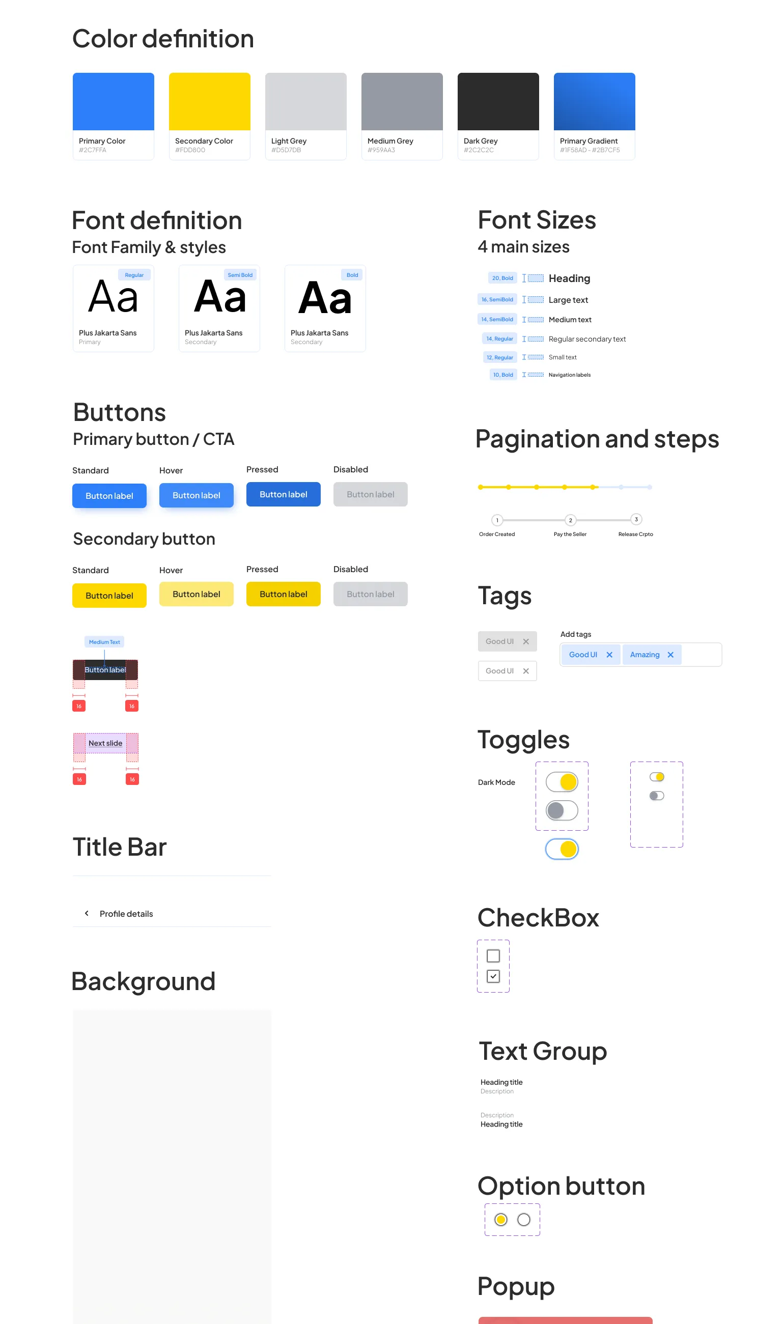
The definitions frame on the Components page sets it all down — colours with their hex values, Plus Jakarta Sans and its sizes, buttons in every state, a P2P step tracker, tags, toggles, checkboxes, option buttons, toasts and the curved main header. It includes a Dark Mode switch, though no dark screens are among the frames shown here.
₦1,000,000.00 · Combined wallet value
The only family: 20 Bold headings, 16 and 14 SemiBold text, 14 and 12 Regular, 10 Bold tab labels (definitions frame)
- 1Colour
Blue primary, yellow secondary, three greys and the header gradient, each with its hex.
- 2Type scale
Plus Jakarta Sans at six sizes, from 20 Bold headings to 10 Bold tab labels.
- 3Primary button
Blue, in standard, hover, pressed and disabled states.
- 4Secondary button
Yellow, in the same four states.
- 5Spacing
Redlines mark 16 px either side of a button label.
- 6Step tracker
For P2P trades: order created, pay the seller, release crypto.
- 7Toggles
Including a Dark Mode switch.
- 8Option button
The yellow radio used for choices such as the mobile network.
Key screens
Verified in one sitting
Before money moves, the account is verified. The first screen asks one thing — the country of residence — then lists the three steps ahead: personal information, a government-issued ID and a liveness check, with an estimate of 10 minutes.
A card that behaves like one
The virtual card shows its balance, a masked number, the expiry and a hidden CVV, with Add funds and Withdraw underneath. A transaction’s details open as a sheet over the card: type, amount, date, one sentence on what happened — here, a withdrawal from the card into the Bytefi wallet — and Report a problem.
A statement, not a ledger
Transactions are grouped by day and written as sentences — a swap from naira to Bitcoin, a transfer to an account number, a deposit — each with a signed naira amount and a time. A download button sits in the header.
Outcome & learnings
Bytefi is a complete design file: 110 app frames in seven sections, with a definitions frame for colour, type and components. How it was built afterwards isn’t covered here.
Read back now, clarity-first holds up best where it is most literal — the card and the statement. The part to settle is the shell: Home and Transactions use different headers and tab bars, while the cover composition shows Home with a blue header instead of a charcoal one. One shell, and a copy pass on receipts and step labels, would come before handoff.
open in the file
- One header and one tab bar across every screen
- A copy pass on receipts and step labels
- Dark screens for the Dark Mode switch — or drop the switch