Client · Energy delivery
Quicrefill
The marketing website for Quicrefill, an on-demand energy delivery service in Nigeria: order cooking gas, diesel, petrol or an electricity top-up from your phone. One site, two doors — Get App for customers, For Business for vendors.
Contents · Overview
Overview
Quicrefill delivers energy on demand from Lagos: customers order cooking gas, diesel and petrol, or top up an electricity meter, in an app, and a verified local vendor delivers. The home page also lists solar installation and EV charging.
This is the website in front of the app. It has two jobs — get customers to download the app, and get vendors to sign up — and it answers support questions before they become tickets. The app itself is a separate case study: Quicrefil App Design.
Challenge
“We aim to make energy access as simple and reliable as ordering food or booking a ride.”
Having gas or diesel brought to your door is a new habit for most people. The site has to say what the service is in one line, show why it is safe to trust with hazardous goods, and make the next step obvious.
It also speaks to two very different people: a household or driver who needs energy now, and a gas station or fuel vendor deciding whether to sell through Quicrefill. Each needs its own path, without the other getting in the way.
Goals
goals, as the site carries them out
Say it in one line. What Quicrefill delivers, and that you order it from your phone, before the first scroll.
Two clear doors. Get App for customers and For Business for vendors, side by side in the header and the hero, and again at the end of How It Works.
Show the order, don’t just describe it. Three steps, each beside the app screen that does it.
Answer before anyone asks. Delivery time, payment, scheduling, tracking and cancelling are answered on the page; support has search, topics and a request form; WhatsApp is one tap away everywhere.
Planning
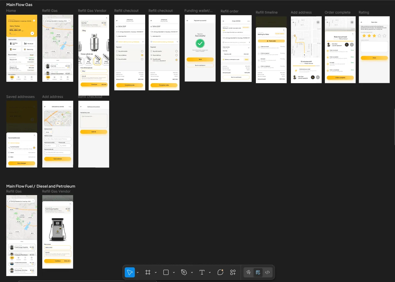
Quicrefill’s planning board is in Miro: Quicrefil App Design. It’s linked rather than embedded, because Miro boards load empty for visitors who aren’t signed in.
For the website, the starting point was the two audiences and the questions each brings. A customer asks what can be delivered, how fast, how to pay and whether it is safe. A vendor asks how to join, what it costs and how they get paid. Every page answers one of those sets.
Two audiences, two paths
- Visitor lands
- Ordering or supplying?
- How It Works — Three steps, each beside its app screen, then reasons to trust it and a FAQ.
- Get App — App Store and Google Play buttons; iOS 13+ and Android 8.0+.
- For Business — Benefits, a four-step onboarding, fleet tools, the fee structure and Talk to Sales.
- Become a Vendor — The application form, also linked from the home page and every footer.
Information architecture & flows
The header holds three destinations and the two doors; everything else hangs off the home page and the footer. Each of the six services — cooking gas, petroleum, diesel, electricity top-up, solar installation and EV solutions — has its own page on one template: how it works, safety, reviews, an invitation to that kind of vendor, and a FAQ.
Sitemap
- Home
- About Us
- How It Works
- Service pages ×6 — /services/cooking-gas, /petroleum, /diesel, /electricity-topup, /solar-installation, /ev-solutions.
- For Business
- Customer Support — Search, four topics, featured articles and “Submit a Request”.
- Get App
- Become a Vendor — Each service page ends by inviting that kind of vendor to apply.
Placing an order, as How It Works tells it
- Open the app
- Choose service — Cooking gas, diesel, petrol or electricity — then the delivery address.
- Quantity & window — Deliver now, or pick a time slot.
- Pay — In-app wallet, card or bank transfer.
- Track live — An in-app map; a notification when the rider is on the way and when they arrive.
- At your door
how it works, top to bottom
Three summary cards first, then each step again in full beside the app screen that does it — home and quick actions, the vendor map, the live order timeline. Four reasons to trust it and a five-question FAQ close the page.
Page structure
The pages share one rhythm: a centred title and a one-line promise, a row of cards, alternating rows of text and phone, then a closing call to action and a footer with both store buttons and a newsletter sign-up. A visitor who has read one page knows how to read the next.
Visual design & system
One warm yellow on white, with near-black for type and the main buttons. The yellow carries the hero, the icon circles and the primary buttons; everything else stays neutral, so the phones — yellow and white themselves — read as part of the page. A toggle in the header switches to a dark theme built from the same tokens.
Energy Delivered. On-Demand.
Headings, as named in the stylesheet
Order cooking gas, diesel, petrol or top up electricity — all from your phone.
Body copy, as named in the stylesheet
About Us · How It Works · Customer Support
Navigation and buttons; the font the page actually loads
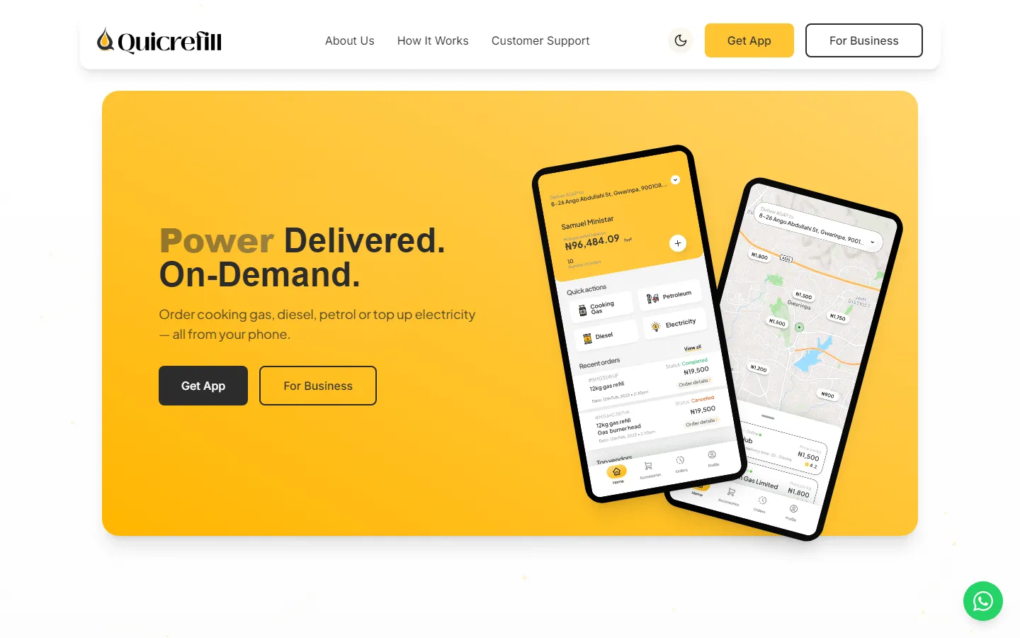
- 1A headline that rotates
The first word changes — Energy, Power and Resources all appear in our captures — while “Delivered. On-Demand.” stays put.
- 2Two doors
Get App for customers (solid), For Business for vendors (outline). The same pair sits in the header.
- 3The app’s own screens
The phones show the home screen, quick actions and vendor map from the Quicrefil app design.
- 4Light and dark
A theme toggle; the stylesheet defines a dark version of every colour token.
- 5WhatsApp, everywhere
A floating button that opens WhatsApp with a greeting already written.
Contrast holds up: ink on the brand yellow measures about 8.8:1 and the grey subtitles about 4.7:1 on white. The one rule the palette implies is never to put white text on the yellow — that pair is only about 1.6:1.
Key screens
About
The company in its own words — “Where Energy Meets Convenience, Recharging Lives.” — then its story, mission, vision, four values (reliability, transparency, safety, innovation), a timeline and the team.
Customer Support
Search first, then four topics — ordering & payment, delivery tracking, account & verification, technical issues — and featured articles. If none of that helps, “Submit a Request”; the page promises a reply within 24 hours.
Get App
Store buttons at the top, the app’s home screen below them, then why to download, the app’s features and what it runs on: iOS 13+ and Android 8.0+.
On a phone
The header folds to the logo, the theme toggle and a menu. The hero keeps its headline, both buttons and the phones, stacked in one column.
Build & handoff
The site is a React single-page app: React Router for the pages, Radix UI primitives, Framer Motion for the reveals, and Tailwind with its colour tokens defined once for light and once for dark. The page loads Lovable’s script and Google Analytics through Tag Manager.
Two small details carry the contact paths. Every WhatsApp button opens a chat with “Hello QuicRefill, I’d like to know more about your services.” already typed. And the vendor application is a single page in five parts — personal details, business, operations, motivation and agreement — that says up front it takes about five minutes.
:root {
  --background: 0 0% 100%;
  --foreground: 0 0% 17%;
  --primary: 42 100% 60%;
  --primary-foreground: 0 0% 0%;
  --muted: 42 100% 95%;
  --radius: .5rem;
}
.dark {
  --background: 0 0% 17%;
  --foreground: 0 0% 100%;
  --primary: 42 100% 60%;
  --primary-foreground: 0 0% 0%;
  --muted: 0 0% 25%;
}Outcome & learnings
The site is live at quicrefill.com. Reading it back for this case study turned up a short list of things to finish:
open on the live site
- Connect the App Store and Google Play buttons — they don’t point to store listings yet.
- Load the type the stylesheet asks for: headings name Sora and body text Plus Jakarta Sans, but the page only requests Inter and Poppins, so visitors without those two fonts installed see a fallback.
- Replace the social-preview image, which is still the site builder’s default.
- Swap placeholder content for real: the “Partner Logo” slots on About and the sample reviews on the cooking-gas page.
the lesson
Check it the way a crawler sees it.
Every route returns the same small HTML shell and builds the page in the browser, and the home page’s sections only appear as they scroll into view — our own full-page captures came out blank below the hero. Search engines and link previews can miss that content the same way. Pre-rendering the pages, and showing content before the animation rather than because of it, would fix both.